TC Larson

Stories and Mischief

  • Home
  • What’s This All About?
  • Expression With Paints
  • Contact Me

Finding Joy in the smallest Places

23
Dec

Finding joy used to be like looking for sugar in a candy store, finding wonder and happiness was like stumbling through a daisy field looking for a flower. Without trying there was just so much happy to notice, and so much excitement that punctuated every day.


Sugar! Flowers! Yay!


Some of that was due to my natural temperament, some of it was probably connected to being younger, some of it was undoubtedly due to the unearned privilege of being insulated from the hardships that so many people face on a daily basis. It wasn’t that everything was constantly smooth or went according to plan, but those glitches felt like the exception and were fairly easy to recover from.


If I had to write about joy at that point, it would have been no problem.


It’s a little harder now, though not impossible. It’s a matter of perspective.


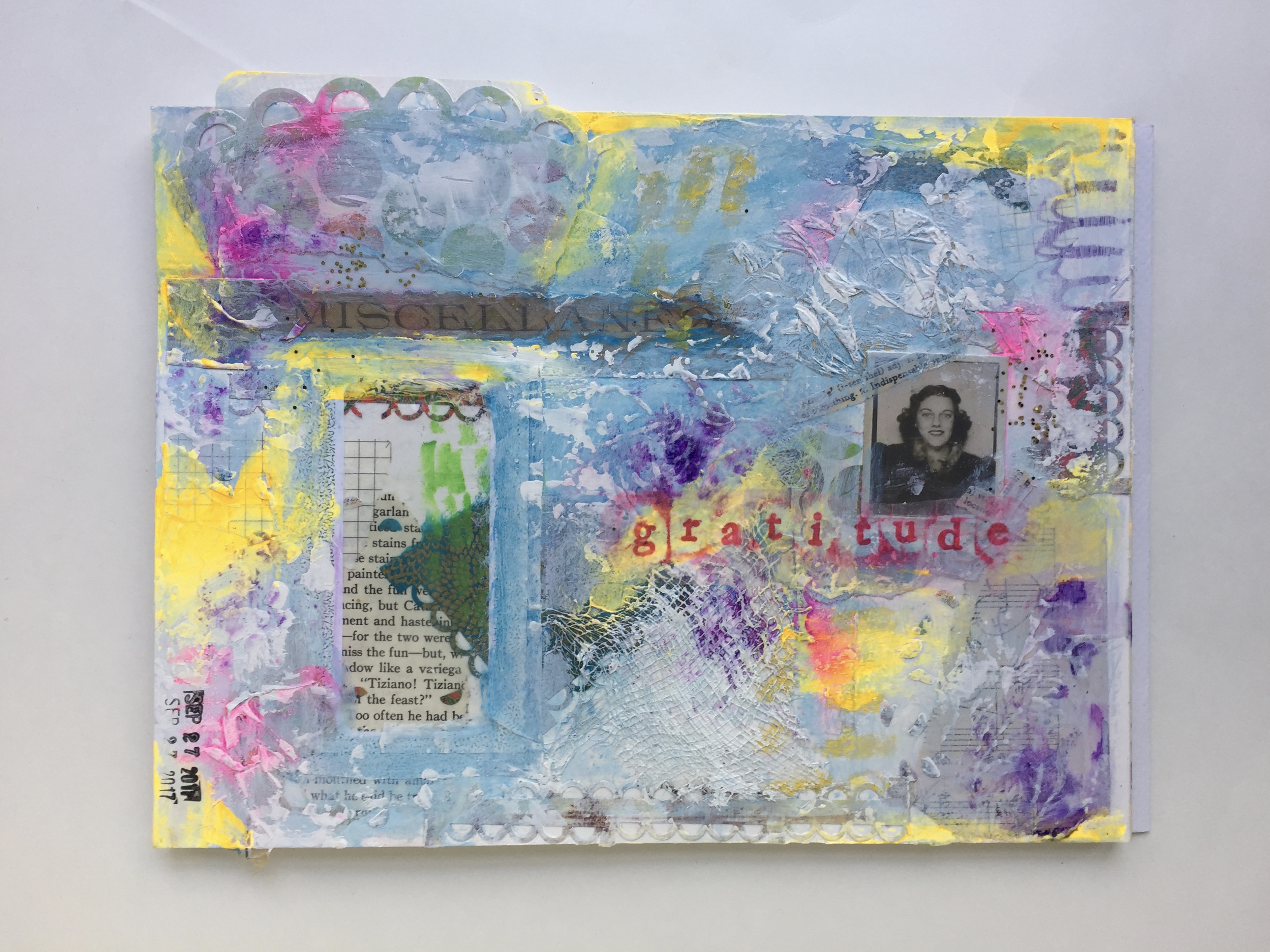
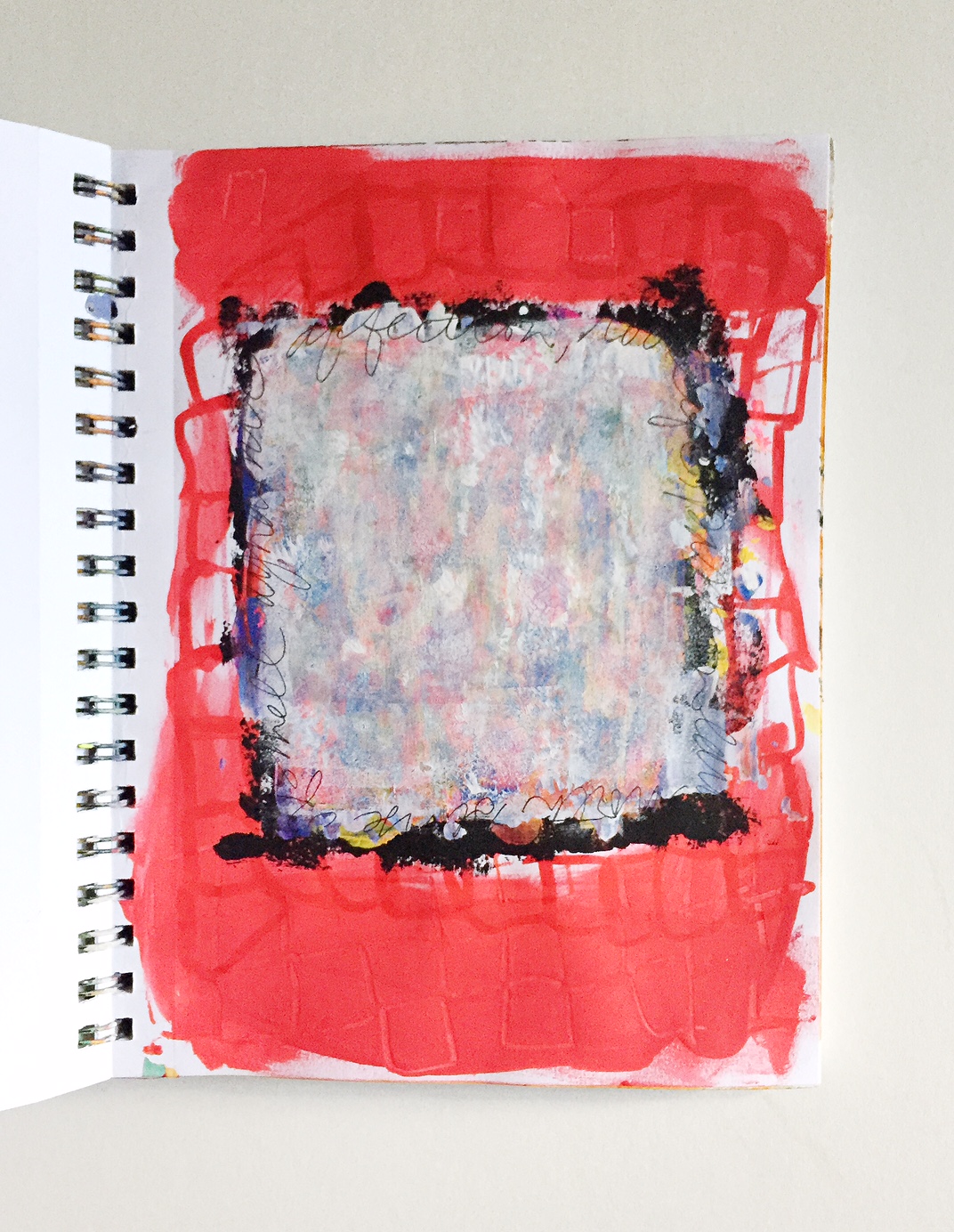
Last year I tried to write about joy during Advent, and even tried a couple art journal pages to work it out, but none of them were quite right. Here’s where you can check that out. There I mention a difference between joy and happiness.


Joy seems to be consistently connected to a spiritual state, a grounded connectedness to ourselves, those around us, and a higher spiritual purpose. …Happiness is almost a consumable good; joy is more durable.


These days finding joy is more difficult. There are so many things that seem to be going off the rails, globally and locally. Here’s a summary of sound bites from this year, and when listening it’s no wonder it can be hard to feel joyful. It’s been a helluva year and our political in particular continues to be intensely disturbing. Sex scandals, election tampering, a gag order for scientists, undercutting environmental safeguards, it’s all overwhelming and disheartening.


However, at what point could we ever have looked at things in the world on a large scale and feel joyful? There’s always been something going haywire, some despot wreaking havoc, some natural disaster displacing whole communities. You’d think we’d start to notice that “desolation” is humanity’s default setting.


Okay, I’m not saying we’re quite like that movie, but you get the idea.


According to the Exercises of St. Ignatius of Loyola, desolation is one of two states humans move from and into. Sounds dramatic doesn’t it? The opposite of desolation is “consolation”. Consolation is used to describe moods of harmony and settledness, desolation is used to describe moods of inner turmoil or disconnectedness. (Click to learn more.) It is assumed that people will move from consolation to disconsolation. People won’t stay in one or the other indefinitely, which is important to remember so we have hope and appreciation.


Hope and appreciation.


I think those are both tied to joy.


|||

The thing I’ve discovered is my joyfulness improves when I adjust my perspective from being focused on large scale things down to smaller scale things:

The sound of my boys together downstairs practicing crazy loud music on their instruments, and actually being able to make out a tune.

Watching someone open a door for a stranger, and the stranger respond with gratitude. 

The confidence of having a full tank of gas in a car you trust to get you to your destination. 

Waking up one of your kids and having one of their first statements be, “I love you, Mom.”

These small moments remind us of our humanity, remind us of our smallness, and help restore out connectedness to others around us. 

When I pay attention and take time to notice these things, I do better. I discover joy, that warm feeling that buoys us through hard times, that quiet confidence that there is good in the world if we’ll only remember to call it out in ourselves and others.

Joy can be a choice, and we have agency in cultivating more of it.

This is not joy that disregards the facts, this is joy that searches out the positive, the good, the things that tie us together as humanity and elevate us to our better selves. This is joy that seeks the details, the secret acts of good will, the quiet gestures of connection and celebrates those. This is calm noticing that settles down into the smallest moments, and then acknowledges their energy and the positive force they ripple out into the world. This is no flimsy pollyanna cliche. This is a brave act.


Original art by TC Larson

Original art by TC Larson


I really do wish you a joy-filled holiday season and believe you can help create that by deciding to choose joy. Go get ’em tiger.


Discussion: Comments {0} Filed Under: Art Journaling, Church Life, Faith, Little Things Big Things, Uncategorized

Thanksgiving and Connections

21
Nov

This week is Thanksgiving, and it’s a time when we often think about gratitude and connect with family.


Original art by TC Larson

Original art by TC Larson


For the past couple months I’ve been working in a journal I made myself, all with a focus on connections as part of an online art journal community called Get Messy. Perfect, isn’t it? I think I’ve mentioned it here before, but the Get Messy group is a lot of fun to be a part of, and the convenience of an international online community means there’s almost always someone else working in an art journal at any time of day or night.


With the focus on connections it seemed appropriate to share my journal here, especially since I was surprised by the way family emerged as a theme. I guess I shouldn’t have been so surprised, but I began by approaching it from a much broader perspective so when the old photos kept calling to me (these were only replicas of random vintage photos, not originals) it was unexpected.


The other part that surprised me was the way I felt pushed to incorporate photos of myself as well. I almost never do this. So I’m sure you’ll understand when I say this journal ended up feeling  pretty personal.


There are many reasons to be grateful this Thanksgiving, even in the midst of a year that for many has been quite challenging. I think when we choose to focus our attention on those beautiful things, those which call forth our best qualities and values, we can always find examples of these in real time. It’s a great week to do this!


Here are some of my favorite pages and a quick two-part video flip through.


Find me on Instagram: @tclmn

Find me on Instagram: @tclmn


IMG_0916

Original artwork by TC Larson


Find more of my pages on Instagram: @tclmn


Here’s wishing you a very happy Thanksgiving!

Discussion: Comments {1} Filed Under: Art Journaling, Family

Trying a new thing: an art journal video for fall

23
Sep

Greetings! I’m trying a new thing and it’s kind of scary. I’ve created my first video of the process of creating an art journal page. The whole process is filmed, start to finish, and includes a few voice-overs (does anybody love the sound of their own voice? ‘Cause I sure don’t.).


The way I figure it, art journaling has become something I use every week — every day if I can — and maybe someone else will find it useful to their own journey in the world. Not all my art journaling is full of deep thoughts or mystical ah-ha! moments of illumination. Very few of them can be described that way. However, that doesn’t minimize the significance of it, nor does that mean it’s not still useful.


Much of my art journaling is simply appreciating things around me, or processing something that’s on my mind. There’s a quote that says writers get to taste life twice, and I believe that’s true for many art forms, including art journaling. So you can think of this as merely the process of enjoying the little details of your life, and doing so through smoothing paint on a page. I’m going to include what mine ended up looking like, but yours could look COMPLETELY different and that right there, folks, is the beauty of art journaling. You just can’t make it look wrong, and you have to love that. It’s got built-in accomplishment.


Completed fall-themed art journal page

Completed fall-themed art journal page


Below the video, I’ve included the main materials I use. Please do not worry about having fancy stuff or getting anything special. You might have a little container of water colors around — use that. You might have highlighters or markers — use those. One of my favorite things is to scrape paint across a page using an old gift card; completely un-fancy. Start where you are because this is intended to be freeing and fun. And if you have time to come back and tell me about your experience, I’d love it!


Materials used:

Ballpoint pen

Pitt pen

Ceramcoat acrylic craft paint

Craftsmart acrylic paint

Liquitex heavy body paint

Palette knife

Oil pastel

Pages from an old book

Super-pointy platinum pen (not its official name but that’ll have to work)

Random paint brush, old gift card


Thanks so much for letting me share this with you, and for being a gentle space to try new things.

Discussion: Comments {1} Filed Under: Art Journaling, Paints and Pages, Uncategorized

Violet and Purple as The Color

15
Sep

Here we are, finally coming to the end of our quirky exploration of the significance of color. We’ve covered Blue, Red and Pink, Green, Orange (with a resistance to pumpkin spice because when that post was written it was TOO SOON, people. But now that we’re a little further along into fall, I suppose it would be fine for you to indulge in your love of “The Spice”. As if I could have stopped you!), and Yellow. Now we go across the color wheel and land on Violet.


Violet is associated with the material silver, and amethyst stone.


It’s the body part the crown of the head.


It’s symbol is a lotus flower.


It signifies total well-being, and is connected to the universe,


royalty,


peace,


connection and a quick perception of spiritual ideas, the “fine thread of life”. Isn’t that a lovely thought?


IMG_0234


Violet is connected with pure knowing, highly developed spirituality, the color of priestess, love and respect for others, inspirational creativity.


It’s the highest frequency in the visible spectrum so people equate it with highest spiritual intuition.


In many traditions violet (or purple) is a regal color reserved for royalty and the gods.


PC: Morguefile @ricetek

PC: Morguefile @ricetek


Confucius warned followers the expense of purple dye would cause social disorder! He thought it would be like Black Friday at Best Buy. It is the color of enchantment, which begs for a few more images…


IMG_0167


IMG_0059


A couple more interesting books I’ve referred to for this series are Painting Path: Embodying Spiritual Discovery through Yoga, Brush and Color by Linda Norvick, Painting from the Source: Awakening the Artist’s Soul in Everyone by Aviva Gold, and Colors for Your Every Mood: Discovering Your True Decorating Colors by Leatrice Eiseman.


IMG_7758

Sorry, not sorry. Some days are just full of color!


As a closing note, I think what this series has illuminated for me is the non-verbal power of color. We don’t always know why we’re drawn to a specific color, or why one mood makes us want to be around a certain color. We don’t think about it too much, in most instances. But there may be more to our color choices than we realize, more meanings, more unspoken significance. I think that’s why art journaling has become such a valuable part of the rhythm of my life. When I can’t find the word, I can find a color. If I haven’t figured something out, I can at least squish a bunch of paint on a page and let that do the figuring for me. If things are complicated and difficult to process, I can allow color to help me hash things out. This really works, and even if I don’t understand why I keep going to that bright green (for example), one more layer into it, I might get a crazy Ah-ha! moment, whether it’s in my head/heart or in the journal.


I have dreams of offering some more guided art journaling opportunities in this space. I don’t know exactly what that looks like, and I should probably start small. There will always be other projects and topics, so even if art journaling isn’t your thing (although it might be and you just don’t know it yet), there will still be reason to come back here to visit.


I’ve got one last colorful treat for you, a great way to slide into the weekend. This is such a celebration I’ve been holding off on using it until now. It seems like the perfect way to end this series of color meanings. [Note: While this video is visually stunning, tin my opinion, here are folks who feel it appropriates Indian culture. I think that’s a fair argument. It’s just so gorgeous, and I love travel, so I find it more of an appreciation of Indian culture. It is a little noticeable that Beyoncé is portrayed in specific garb; it would have been super cool to meet a fresh new voice of someone of Indian descent. However, it is Beyoncé, and who can argue with her?]


Here’s hoping you have lots of color in your day!


Discussion: Comments {0} Filed Under: Art Journaling, Uncategorized

Everybody needs some Yellow

9
Sep

Yellow is one of the colors I love most. [Quick story: I once brought home a cool industrial coffee table once. It was this great deep, distressed yellow with casters and a glass top (which was balanced precariously on top, I can admit it). Turns out my husband thought it was less cool than I did, because when he came home and saw it positioned in the living room he asked when our construction site was going to be done. Stinker! He was right though, and try as I might it just didn’t fit with the vibe of anything else we had. I was sucked in by that beautiful yellow.]


IMG_7931


Yellow’s many associations:


amber, topaz, citrine


fire, direction: south. The solar plexus, the sense of sight, a circle or a triangle,


intellect, vitality, reason, cheer, and optimism.


In some cultures, yellow signifies royalty and has connections to gold and sun (think sun gods).


It can also signify change and transformation.


Instagram: @tclmn

Instagram: @tclmn


Yellow is connected to balance, to teachers or students (formal or informal), thought and concentration, being high-spirited and restless.

^^^^

These are prime reasons I resonate with yellow, though I’ve never known this until I started researching color meanings. Restlessness? Check. The curiosity required to be a student or a teacher, or the desire to learn new things? Check. Balance? Not so much, but it’s something that has a push-pull attraction for me. Yellow is also associated with joy, a sense of playfulness, hope, and being outgoing. Those sound lovely, don’t they? And finally, for Carl Jung it signified intuition, something that for me tends to inform the way I interact with the world around me.


Yellow might be my favorite.


It’s interesting to find out how other cultures view colors or how their language for colors came about. Here’s a video that summarizes some of the ideas in the book by Guy Deutscher about color and language. (I mentioned this book in another post you can read here.)


fullsizeoutput_1fb


I’ve gotten a lot of information and inspiration from a book that might raise some eyebrows. It’s called The Women’s Book of Healing by Diane Stein. Prepare your eyebrows. The subtitle is “Auras, Chakras, Laying on of Hands, Crystals, Gemstones, and Colors” (note she used an Oxford coma, just for a little more controversy). There was a time when I would have been afraid of this book or thought anyone reading it was wandering into dangerous territory. However, while I don’t endorse all the material in the book, I do think there are mysterious things in the world, things we can’t explain, and things that intuitively make sense. Rather than run away from things that aren’t explained by logic or measurable metrics, I think we can examine them and take from them what is worthwhile.


Next week is the finally installment of our Color Meanings series, and it feels right to go across the color wheel and close things out with violet or purple, which is yellow’s direct complement. Hope to see you back here next week!

Discussion: Comments {0} Filed Under: Art Journaling, Uncategorized

Nothing rhymes with Orange

1
Sep

Orange has a bad reputation, one it doesn’t deserve.


It’s seen as garish, or associated with Halloween and all things pumpkin. [I know there are pumpkin spice fans out there just waiting for the starter gun of fall to signal the return of market saturation (new: pumpkin spice bratwurst! Seriously, if you want to see how far it’s gone — and I know these are NOT all photoshopped — check out this silliness) but it’s not time yet! You can’t make us!]


Orange is used this way, I’m not arguing with that, but it’s not the only way to see it.


IMG_0041


Think of the distressed finish of an Italian inspired room or a terra-cotta walkway. Those don’t strike me as garish. They’re rich colors that (to me) convey warmth and hospitality.


Orange is also associated with the positives of healing, wisdom, flourishing emotions, as well as  inspiring courage, reasoning ability, and is said to stimulate the appetite (maybe that’s why it’s connected to the whole pumpkin spice craze).


IMG_7928


It’s also connected to a crescent or triangle shape. Its sense is taste (thus the appetite stimulant), its direction is west and its element is water.


Finally, if you haven’t seen this video from Kirsty Mitchell Photography yet, you’re in for a treat. It’s a feast for the eyes and her photography and design are breathtaking.


Do you use orange in your life, beyond fall or pumpkins? I’d love to know! 

Discussion: Comments {2} Filed Under: Art Journaling, Uncategorized

Green — You like it more than you Think

19
Aug

Green is a full of built-in meanings: growth, renewal, nature, earth. It’s a color that can be difficult; when worn it can draw out certain undertones in people’s skin and make them look sallow. The same goes for home decorating uses as well. Who wants to look even more washed out in the bathroom in the morning? No thanks.


However, green is replenishing and calming, neutral as a backdrop for all things outdoors, plants and animals, even homes. If you’re in the market for a new place to live, you’re probably going to be affected by the state of the yard, which will give you a first impression of the house itself.


IMG_4454 (2)

This is a pretty old journal page, but I still like what’s going on in it.


Depending on your exposure to medical environments you might have associations with a light green, so often used for scrubs or hospital rooms. In fact, according to the book, Colors for your Every Mood by Leatrice Eiseman:

In 1914, a surgeon at St. Luke’s Hospital in San Franscisco was disturbed by the glare of the white walls, drapes, towels, sheets and so forth. He chose a lettuce-leaf green to have his operating room painted because it is the complementary (or opposite) to red and pink — the colors of blood.  The color rapidly gained popularity. Thousands of surgical suites, uniforms and drapes were eventually colors green…This “eye-ease green” has been scientifically proven to keep the surgeon’s eyes acure to red and pink, to relieve glare, and to be psychologically cool.

That also explains why we see that pale green in school buses and buildings as well — the same color spread to educational environments too.


Green is connected with air, jade, healing, compassion, and the direction east.


There are lots of imperfections with this but I stand by the message.

There are lots of imperfections with this but I stand by the message.


fullsizeoutput_1f5


Is this green or blue? I used both colors, so maybe it's in the eye of the beholder.

Is this green or blue? I used both colors, so maybe it’s in the eye of the beholder.


For a mindbending discussion of color and language, including green, check out this book by Guy Deutscher . It talks about early languages and how when analyzed there seems to be a wide spectrum of colors that are never mentioned, and naming objects with colors we would never associate with the object, such as green honey or a wine-dark sea. I won’t give away how he develops the relationship between color and language, but it is fascinating.


Isn’t it interesting to think about colors and why we like or dislike them?


I’d love to hear your thoughts so feel free to comment!


I haven’t been very good at tagging colors with #colorfun but I’ll try to do better. Use that hashtag for your colorful pics or tag me @tclmn on Instagram so I’ll be sure to see them!


Discussion: Comments {0} Filed Under: Art Journaling, Uncategorized

Red and it’s Subdued Friend, Pink

4
Aug

Red has so many associations, it’s hard to know where to start. Power, luck, sensuality, alarm, and intensity all come to mind without even working at it. In our first home we painted the living room red and I loved it enough to use a deeper variation of red in our current home (which I hope we’ll be in for many years to come). My artwork doesn’t usually have a lot of red, but often I’ll need some version of deep pink for it to feel complete.


IMG_0009 

Red is connected to a square shape, the sense of smell or touch, the heart, and our core or root.


Red square


IMG_7955 (2)


If you’re interested in reading something else related to “red” I wrote a thing you can read here.


IMG_0010


Red isn’t only something the impacts us psychologically. It’s physical too. The color red affects our pituitary glans when we are exposed to it, and it sends signals to release adrenaline. This in turn improves our sense of smell, our taste buds are more sensitive, and our appetite improves. (Summarized from Leatrice Eiseman’s Colors for your Every Mood)


IMG_0008


Rose or pink is associated with air, east, love, touch, and equal-armed cross shape (think of a plus sign). Compassion and positive self-love are tied up in this color.


IMG_0011


Pink is a whole different animal, even though it’s related to red. It can seem thin or watered down, sugar-coated when used with other pastels. It can also be vibrant, youthful and energetic. Even though growing up I was taught pink and red clash with one another and the combo should be avoided, I happen to like the way they play off one another. You can tell they’re cousins.


IMG_7943


What do you think of red? Do you wear it much, use it in your decorating? Is it a color that draw or repels you? I’d love to hear about it so leave a comment with your thoughts!


Discussion: Comments {0} Filed Under: Art Journaling, Uncategorized

Blue: Everybody’s Favorite Color

12
Jul

While the title of this may be hyperbolic, if you ask people their favorite color, the majority will pick blue. Blue is calming, versatile, and depending on the shade it can even function as a neutral.

PC: Morguefile @JessicaGale

PC: Morguefile @JessicaGale – That’s a beautiful winter sky.


Blue is associated with a complex myriad of things. It can be connected to creativity, self-understanding, and loyalty. It has been proven to lower blood pressure and heart rate, and promotes calm.


Of course, we’ve got to let is also be associated with “being blue” or feeling down. This is the happiest song about being blue I can think of. Plus it includes yodeling, which is a skill I admire and pretend I have.


IMG_7976


Blue is also connected to the throat, a lapis, and a crescent moon or a circle shape. (I don’t totally understand why, but that’s the way it goes with associations. They can be hard to pin down.)


IMG_7972


In a flukey spooky coincidence, a friend of mine published this blog post and mentions a few things that have been popping up in my life lately, so I thought it would be fun to mention it here. Think all things blue.

If you want to play a little game,  join me on Instagram. Use the hashtag #colorfun and show us your favorite colors! 

Discussion: Comments {0} Filed Under: Art Journaling, Little Things Big Things

Vivid Meaningful Color

6
Jul

Summer is a great time to appreciate color. It’s all around us, and not just green, although we should be sure to sing the praises of green especially so we remember it well once we’re in the long white-coated months of winter. Flowers come to mind first, but plants in general are beautifully colorful in the summer. People are open to more colorful clothes, and even our skin tends to move toward deeper color despite our application of sunscreen.


In addition to this assorted burst of pigments, colors in themselves have associations, meanings we ascribe to them if only subconsciously. That’s why hospitals rooms are painted certain colors while restaurants are painted others. But why are we attracted to certain colors and repelled by others? How much of that is based on our own personalities and how much do we owe to the way color is used in interior design and even advertising or the media?


Over the next few days (ok, let’s be realistic, it might be weeks) I think it would be interesting to look into different colors and their meanings in Western culture. Don’t worry, I’ll keep it brief and it will deal in generalities so we don’t lose the folks in the back who just peeked into the room because they heard voices.

IMG_7944


IMG_7949


IMG_7945


IMG_7954


IMG_7956

So I hope you’ll check back here and join in. I’d love to hear about your favorite colors and why they’re you favorites. Maybe we’ll even have a little play-along fun over on Instagram and post ourselves wearing colors that make us feel good, even if we don’t know why…yet. Let’s use the hashtag #colorful or tag me @tclmn so I’m sure to see what you come up with!


Discussion: Comments {0} Filed Under: Art Journaling, Little Things Big Things

  • « Previous Page
  • 1
  • 2
  • 3
  • 4
  • 5
  • 6
  • 7
  • Next Page »

Stay Connected

Subscribe to Blog via Email

Enter your email address to subscribe to this blog and receive notifications of new posts by email.

Recent Posts

  • Waiting for justice with bated breath
  • Breath prayers: for those tragic times when breath prayers are all you’ve got
  • The little I have is yours: another breath prayer
  • Moving forward in love
  • Handling hot emotions as we wait
Visual Yummies Please check your feed, the data was entered incorrectly.

Copyright © 2025. Design goodness from Squeesome!